Case 05 · B2C · 2024
Admin panel for a B2C app
How I designed an admin panel from scratch: 11 sections to manage content, news and app settings, replacing spreadsheets and chats.
0→1
Built from scratch
11
Core sections
3
Areas: content, news, app settings
Tables
Complex data tables and filtering
§01
Context
I was the only designer on this project. I owned UX, UI and the component library from the first requirements to developer handoff.
Before the panel, promos, screens and settings were managed manually through spreadsheets, chats and scattered internal pages. This made scaling difficult and increased the risk of errors.
§02
Goal
Design a single interface for managing content, news and app settings for different scenarios and roles, while laying the foundation for a design system.
§03
Constraints
4 months, 1 engineer, 1 analyst.
§04
Design solution
Structure
I organized the panel around the team’s real tasks: separate sections for content, news and app settings, with consistent patterns for tables and filters, so users don’t have to relearn the interface when switching between entities.
MVP and priorities
Together with the team, I prioritized key scenarios by frequency of use and business impact. This fixed the MVP scope and moved secondary features to the backlog.
UX skeleton
I mapped detailed user flows for key scenarios and turned them into wireframes to validate structure and navigation before visual design.
Consistency
I built a base UI kit (tables, filters, forms, steppers and modals) that adapts easily to new entities, with a unified system of spacing, color and typography.
§05
Cross-functional collaboration
I worked closely with the analyst and engineer, from breaking down business requirements to shipping a clear interface.
§06
Impact
The team got a single admin panel for promos, content and key app settings. It reduced manual work and made campaign launches easier for marketing and content teams. Consistent tables and filters made the system more transparent and reduced configuration errors. The base patterns (flows, tables, forms) let the team add new sections without redesigning the interface.
№01
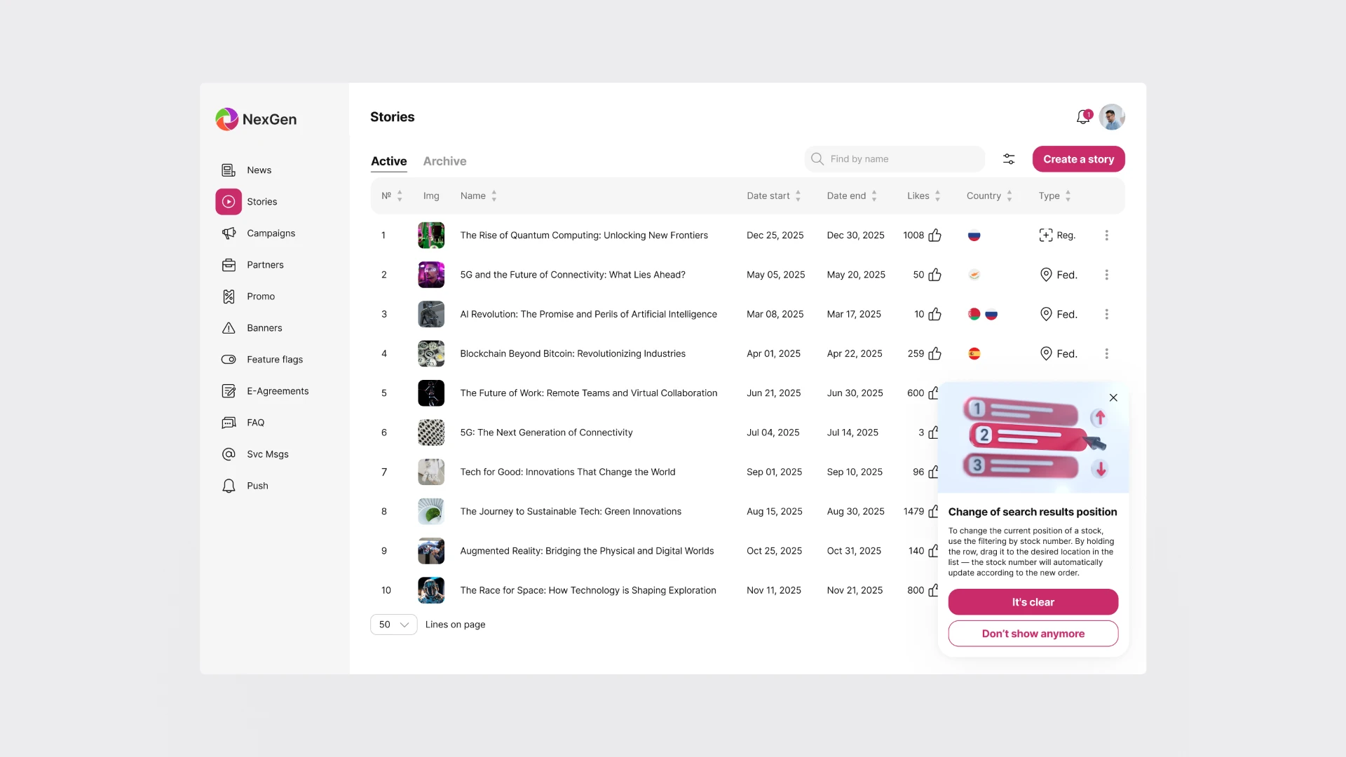
Tooltips appear on the right side so they never cover the main content.
№02
With many filters applied, a progress indicator with a tooltip shows loading status, and the table displays a skeleton until the data is ready.
№03
Drag a row to change the delivery order, and numbering updates by position. Hover shows quick actions. Double-click opens the story content.
Previous case
From web app to mobile-first PWA