Case 04 · HR tech · 2025
From web app to mobile-first PWA
Scope: 15 functional sections with role-based permissions, redesign, responsive layouts for 5 breakpoints (320px, 768px, 1024px, 1440px, 1920px), and a design component library
0→1
Design system built from scratch
15
Functional sections with role-based access
Dark mode
Light and dark themes in the component library
5
Breakpoints: 320–1920 px
§01
Context
I was the only designer on this project. I owned UX, UI and the component library from the first requirements to developer handoff. I built the design system from scratch, including variables, tokens and dark mode.
The product started as a mobile app. The client needed a web version for working with large volumes of tabular data, with the same look and the same core scenarios, and with desktop table usability preserved.
Midway through the project, business requirements changed. Since a lot of work was already done, we agreed to rethink the interface to work equally well on desktop and mobile, with mobile as the priority, and to keep the existing work and deadlines.
§02
Problem
The original desktop-first approach worked well only on large monitors. Many scenarios didn’t translate to mobile, and the app loaded slowly on phones.
§03
Constraints
- 01Limited developer resources
- 02Reuse of the existing backend
- 03Tight deadlines
§04
Strategy
Keep data tables on desktop. Switch to mobile-first while preserving the logic of existing desktop interfaces. Make the transition smooth on tablets and small laptops.
§05
Design solution
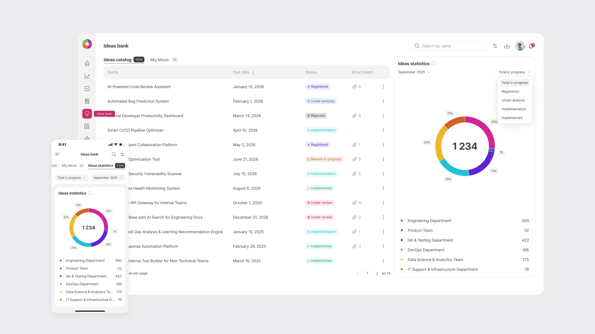
I rebuilt the interface around a mobile-first PWA architecture. Tables became cards on small screens, filters turned into step-by-step flows, and search and filters moved into the header to save space. Each pattern is documented in the component library.
§07
Impact
The PWA matched the existing app visually and kept the usability of desktop tables. Several solutions designed for responsive layouts turned out to work better than the originals and were later reused in the native app.
№01
Responsive layouts designed around how people use each device.
№02
On tablet and mobile, field hints become an icon that opens a bottom sheet.
№03
The filter was redesigned for quick access to selected parameters. Sorting now lives inside the filter, which: 1. makes mobile screens work across more use cases, 2. avoids control-placement problems, 3. makes the pattern more predictable.
№04
On mobile and tablet, tables become information cards.
№05
Search and filters moved into the header to save screen space, and can be switched on or off depending on the context.
№06
On mobile, the filter is split into sequential screens. Breaking a complex task into smaller steps reduces cognitive load.
№07
Pagination gives users control over large datasets. On mobile, lazy loading and screens split by meaning make blocks of information easier to scan. On larger screens, blocks of different structure fit together without overloading the user.
Previous case
Design system
Next case
Admin panel for a B2C app