Case 03 · Design system · 2024–2026
Design System
Tokens, components and patterns for a mobile-first product. The original product is under NDA, so the system is shown on a fictional travel booking app with the same structure, components and states.
26
color tokens
172
icons
5
breakpoints
10
spacing tokens
§01
Why a system
Without a shared system, every new screen meant deciding colors, spacing and states again, and the same components were rebuilt in slightly different ways. I set out to build one source of truth for design and development: named tokens, reusable components and documented patterns.
§02
Foundations
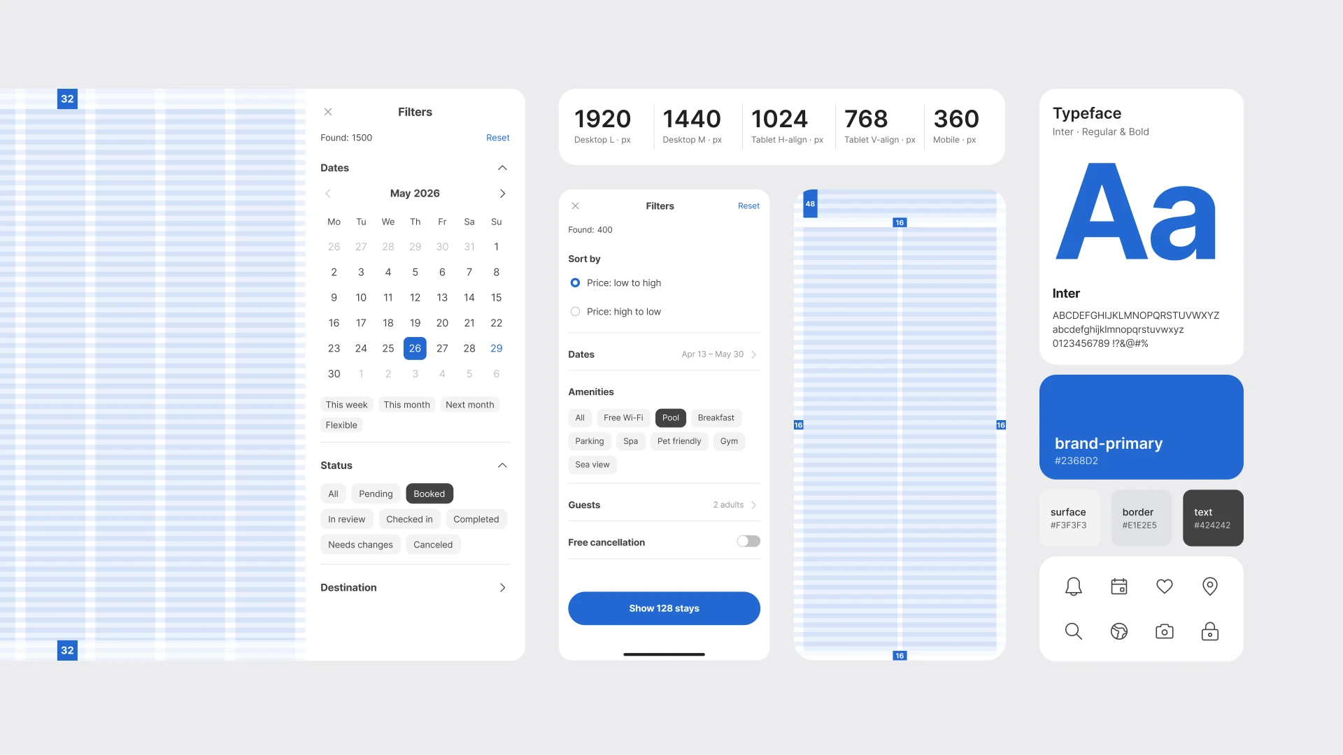
Color is built on semantic tokens: every color is named by its role, with a subtle tint for backgrounds and selected states. Typography uses Inter in two weights, Regular and Bold, with eight sizes from 12 to 40 px, line height on a 4 / 8 px rhythm and slightly tighter tracking as size grows.
§03
Layout
An adaptive column grid covers desktop, tablet and mobile: 1440 with a side menu, 768 and 360. Ten spacing tokens, six radii and five widget sizes keep every layout consistent, from mobile sheets to wide dashboards.
§04
Components
Status is always readable at a glance: in badges, tags and notifications, color, icon and label work together, never color alone. Icons follow a single outline style on a 24 px grid, plus filled sets for files, ratings and quick actions.
§05
Key patterns
Date picker
Day, month and year views share one navigation pattern, so switching scale never feels like a new control.
Filters
Sorting, date ranges and multi-select chips in one scrollable sheet. The apply button shows how many results you will get.
Bottom sheets
Search, single and multi-select lists open from the thumb zone and keep the main action pinned.
Dialogs
Short, single-purpose dialogs: one question, one primary action and a clear way out.
Status
Badges, tags and notifications combine color, icon and label, so status never depends on color alone.
Icons
172 icons in one outline style on a 24 px grid, with filled sets for key actions.
§06
Built for handoff
Components are built with variables, variants and auto layout, so a change to a token or a component updates every screen that uses it. Each pattern is documented with its states, which gives developers one clear reference.
§07
Result
A system of 26 color tokens, 172 icons, ten spacing tokens and a set of patterns that covers desktop, tablet and mobile. New screens are assembled from ready parts instead of being drawn from scratch.
§08
What I took away
A design system is a product too. The most useful decisions were the boring ones: clear names, one way to show status, one navigation pattern for every scale.
№01
Color: semantic tokens named by role, with tints for backgrounds and selected states.
№02
Typography: Inter Regular and Bold, eight sizes from 12 to 40 px on a 4 / 8 px rhythm.
№03
Grid and breakpoints: 1440 with a side menu, 768 and 360.
№04
Spacing, radius and widgets: ten spacing tokens, six radii, five widget sizes.
№05
Badges, tags and notifications: color, icon and label work together.
№06
Iconography: one outline style on a 24 px grid, plus filled sets.
№07
Date picker: day, month and year views with one navigation pattern.
№08
Filters: sorting, date ranges and chips in one sheet, with a result count on the apply button.
№09
Bottom sheets: search, single and multi-select lists with a pinned main action.
Next case
From web app to mobile-first PWA