Case 02 · PWA · 2026
In-app chat for a PWA
An in-app chat for a large PWA, built for fast, reliable communication between employees and managers. The flow was ready for development in 2 weeks, with all interface states covered.
95
Screens, including all states (light theme)
18
User flows
2 weeks
From requirements to a development-ready flow
6
Message types: text, files, forwarding, mentions, voice, links
70%
New components built for the chat
30%
Reused from the existing design system
5
Missing screens found with the AI agent
Dark mode
Across the entire chat section
§01
Context
The chat isn't a standalone app. It's a new section inside a large PWA product, so employees and managers can communicate quickly and reliably without leaving their work tool.
§02
Problem and goal
Design a chat that fits naturally into the existing product, consistent in both look and behavior with other sections, so users don't have to learn anything new.
§03
Constraints
The chat runs inside a PWA, not as a native app, so every decision had to account for platform capabilities and limitations.
An existing design system: new screens had to reuse its components where possible and extend it consistently.
Tight deadlines.
§04
Research
Before designing, I researched references on Mobbin and studied popular messengers to understand familiar interaction patterns, type sizes and pairings, so the interface would feel intuitive from day one. I reviewed the business requirements, summarized the key MVP flows and listed every screen the MVP needed.
§05
Design solution
AI-assisted prototyping
I generated a detailed prototype of the core flows myself using a Figma AI agent, which got me to high-fidelity screens fast. Then I had the agent review the flows to find missing screens, and generated those as well.
Design system alignment
I reviewed and reworked every generated screen: swapped in existing components, built missing ones in line with the design system, aligned spacing and typography with the rest of the app, and checked each solution against PWA constraints.
Chat list and navigation
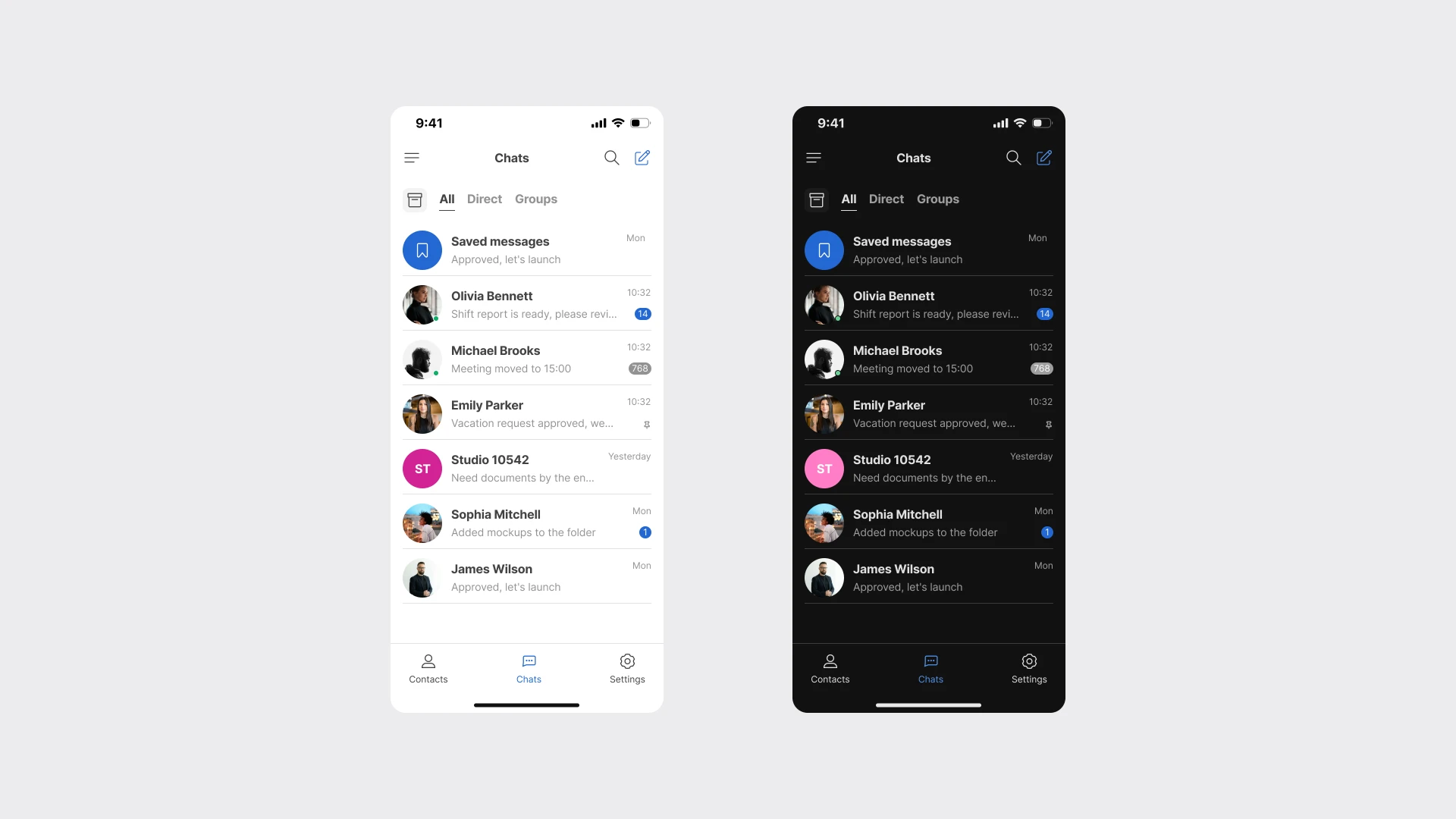
Filters for all, direct and group chats, search, swipe actions to archive, delete or pin a chat, and bottom navigation between contacts, chats and settings.
Messaging
Six message types — text, files, forwarding, mentions, voice messages and links — plus reactions, replies with quotes, editing, deleting, pinned messages, read receipts and a typing indicator. All empty, error and file-upload states are covered.
Group chats
Creating a group, adding members with search, participant roles such as admin, and shared groups, media, files and links in each profile.
Dark mode and visuals
Dark mode built on the finished flows. Empty-state illustrations in the product's style and tiled chat backgrounds that scale cleanly, generated with the Figma agent and refined by hand.
§06
Validation and collaboration
I worked with the PM and two developers. The core flow was reviewed with the team, and additional screens were refined based on their comments.
§07
Impact
The chat has been released. The development-ready flow was delivered in 2 weeks, including all empty, error and edge-case states. New and refined components were added to the design system, and the whole chat section supports dark mode. Using the AI agent let me design the section quickly on my own, without separate analyst or researcher involvement.
§08
Reflection
Working with an AI agent taught me to generate ideas quickly and turn them into production-ready screens in a short time. The key designer's role here is critical selection: deciding what to keep, what to rework and how to fit it into the system.
№01
The chat list follows familiar messenger patterns: All, Direct and Groups filters, search, unread badges and online status. Swipe left to archive or delete a chat, with a confirmation step before deleting, and swipe right to pin it.
№02
A colleague's profile shows their role, organization and department, quick actions to open the chat or manage sound, and tabs for shared groups, media, files and links. Shown in light and dark themes.
№03
A group conversation on a tiled background: a pinned message, reactions, replies with quotes, voice messages, photo albums, link previews, read receipts, a typing indicator, system messages and a deleted-message state. A long press opens the actions menu: react, reply, copy, forward, save, pin, add to favorites and select. Mentions and file attachments are available from the input panel.
№04
Creating a group chat: the contact list, a new group form, adding members with search, and the finished group with participant roles. A new chat opens with an empty state and an illustration in the product's style.
№05
Settings follow the same patterns as the rest of the app: profile photo editing, organization and department, notifications, saved messages and a link to support. Shown in light and dark themes.
№06
A direct conversation in dark mode: the tiled background, reactions and typing indicator, the attachment sheet (take a photo, choose from gallery, attach a file), multi-photo selection and the actions menu with edit, pin and delete.
Next case
Design system